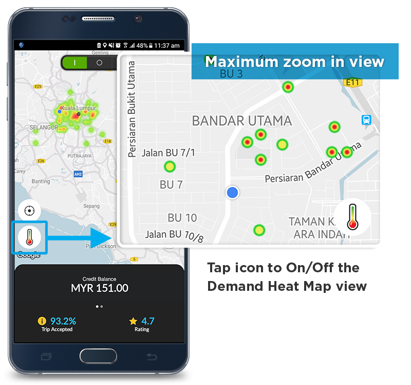
How It Works?
The map shows you where there are incoming Booking request:
- Red = Very High
- Yellow = High
- Green = Medium
- No colour = Low
How to use?
- Use map to identify closest ‘High Demand’ area to where you are & heads towards there.
- Zoom in & out on the map to identify specific ‘High Demand’ areas. At maximum zoom, you will see a dot.